Tuesday, June 26, 2007

Shape: Light and Distance


I'm doing the Strobist Lighting 102 course / exercises, and I the distance exercise is really valuable, I recommend everyone go read the post and do the exercise. The direct link is here.

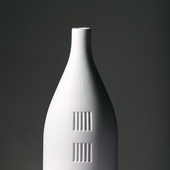
So the exercise to the reader here is: what color is the actual background material? That's right, it's white foam core, and it's only 5 feet behind the vase. But (and here's the a-ha moment), the light is only 18 inches from the vase. So the light it casts on the background is much less intense than the light it casts on the subject (insert inverse square law here).

You can click on this image if you want all the lighting details.

Thursday, June 21, 2007

Duotones


I'm loving duotones. It's been a while since I applied the technique and it's nice to come back to it. Duotones (and tritones and quadtones) are incredibly flexible ways to render monochrome images. Traditionally the technique is used in conjunction with printing, but I love the control and the huge range of possibilities. I don't know of another way to achieve the same results with as much consistency.

So my process is to first convert an image to B&W, either in Aperture or using CS3's B&W layer... then I convert to grayscale, then to 8 bits per pixel, and then to duotone. I'm defining my own duotones as I go and saving them, so that I build a library of good combinations. Finally I convert the image back to RGB color.

I liked the results on this one in particular.

Tuesday, June 19, 2007

Composition


I'm really trying to work on composition these days... Houston Photobloggers did a photo walk in downtown Houston on Saturday, so I took the opportunity to try and focus compositions, shooting the whole time on my 70-200mm f/2.8. The long lens forced me to see differently than I might with something wider.

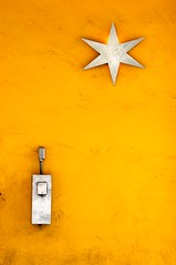
I really like this shot of Cabo's outside wall... I loved the relationship in placement of the two objects and the similarity in appearance, despite their being for entirely different purposes. And the wall color is killer, too.

Monday, June 04, 2007

"Church"


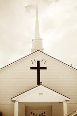
This was just too good to pass up. This is a little church in Stafford, TX (near Houston). The same building could easily be found in a small town nowhere near the big city, it looks like a little country church.

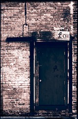
I processed this with CS3, using a black and white layer, a couple tint layers, two layers of "grain" (Add Noise filter) and a couple layers of curves adjustments. I think it successfully adds to the feeling that this could be a little country church.

Tuesday, May 29, 2007

Toning


I'm really into toning these days, especially toning a series (also see The Series as Art on Houston Photobloggers). Some images are just made for a particular tone or treatment. One of the things I love about shooting digital is the ability to experiment with tone and "developing".

This image was "developed" using an infrared-simulating black and white conversion layer, followed by two toning layers and some contrast adjustments. The tone fits the style of the building and the brightness and contrast of the image.

Sunday, May 06, 2007

Windows


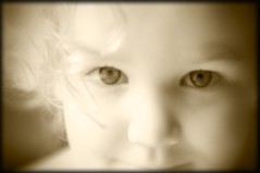
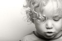
Everyone is probably familiar with the notion of the eyes as windows to the soul. I find this particularly evident in children, especially my own, because I know them so well. Well-captured, well-lit eyes lend so much depth to a picture. The eyes allow you to connect, to imagine who the subject is, maybe what they're thinking.


Anyway, this isn't just about eyes, it's also about a new toy... I got a Lensbaby (the original). I got the original primarily because I wanted the most low-fi version they had. I want the dreaminess turned up to 11. So far (I've had it for 8 hours or so), I love it.

Both of these images were processed in Photoshop CS3, primarily using the new Black and White layer.

Monday, April 23, 2007

Speed


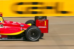
Sebastien Bourdais in qualifying for the Grand Prix of Houston. The yellow and black sponsor banner in the background provided the perfect backdrop for this car in particular. It was just a matter of actually catching the car in the right spot, in focus, with the right blur, etc.

These cars go really, really fast. Watching them on TV just doesn't give you a clue. This was the fastest point on the track, too, which helped because it was impossible to capture the car in focus and not blur the background.

Having said that, there was a little technique here... I was shooting in aperture priority (I usually shoot in manual, but here you don't want to have to manage exposure, the camera can do a fine job), with a small aperture (like f/11 or greater), to force the shutter speed low enough to get the blur (e.g. 1/200th or so). At a wide aperture, the shutter speed would have been much too fast to get a good blur in the background. I shot in aperture priority (instead of shutter priority) so that I could quickly switch modes and capture a person or other slow-moving subject with shallow depth of field.
Friday, April 13, 2007

Shine


Sometimes you make an image and you know there's something there, something you want out of it, but you don't actually know what that something is yet. This was one of those. I kept working it until it was radiantly bright, and then I had it.

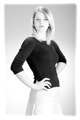
The lighting was keyed with a 48" octobox... I had a silver reflector for fill, a grid on the backround and two more for accents on her hair.

Initial processing done in Aperture, as always, but turning this totally high key and B&W was all Photoshop CS3 (the original is fairly bright, but nothing like this). The border is done with a layer style... it just added more of a sense of radiant brightness.

Monday, April 09, 2007

Gaze


This is all about tone. Creamy skin and warm brown tones, gradients, and rich shadows without extreme contrast.

I think it's very tempting to push images to the limits of contrast, saturation, etc., but the images that keep drawing me back in are the ones that are smooth and beautiful and have sweet tone, like the tone of a simple tube amplifier.

This image engages me, I'm interested in it photographically but I'm also interested in the person, it isn't just an image nor is it just a portrait, it's something in between. There's a mix of mystery and beauty and light and shadow.

Tuesday, March 20, 2007

Close


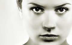
This was an experiment in processing. There's been lots of noise on the net about the image processing that went into the movie "300" and trying to reproduce that look. So I was messing around with some ideas and then went a bit of a different direction. So there's a fair bit of Photoshop going on here.

The crop really emphasizes the title, "Close". It feels claustrophobic and forces you to deal with the intense stare. It also has an incompleteness that adds interest for me (the crop above the chin, for example).

As an aside, Photoshop CS3 really rocks.

Monday, March 12, 2007

Snow Patrol


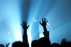
Not a whole lot to say here except that I wanted this shot and waited for it (and took lots of attempts). People move rapidly at concerts, turns out. I really wanted the streaming blue light with one distinctive pair of hands raised with the lead singer out of focus.

Concert photography may push me over the edge for an 85mm f/1.2. My 70-200 f/2.8 is a fabulous lens but another 2 stops would be huge. This was ISO 800... my 10D (yes, due for replacement) is significantly better at 800 than 1600.

Friday, March 02, 2007

Iain


This was shot with a white foam board background and one beauty dish. 1/250 @ f/16 probably. The beauty dish is just above his face and the camera is right under the dish, maybe 2 ft. away. I like the tones in his hair and his expression.

I'm going back and forth on the highlight in the upper left. At this small size, it bugs me a little, but full screen (in a better color profile) I really like it. I have a second version where I Photoshopped that out with a gradient. For the moment, I'll go with this because it's how I shot it.

EDIT: OK, I like it this way. On the dark background it works for me. On Flickr's white page it was bugging me.

Wednesday, February 28, 2007

Relax


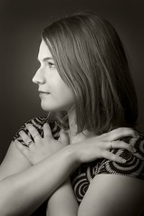
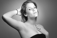
Probably the last one from this series that I'll post... this one is growing on me. It definitely works better in black and white. I love the contrast along the underside of her right arm, and I love where her left hand is. I keep looking at this one... there's something mysterious and unidentifiable that draws me in.

Same four light setup as on the others (beauty dish + 3 grids).

Friday, February 23, 2007

Focus


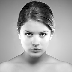
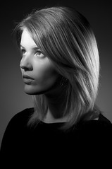
This is a square crop of "Focus" converted to high contrast black and white. I really like the color versions of these but this one in particular I think lends itself to B&W and a square crop. The B&W forces you to deal with shape and tone and contrast and the square crop further enforces the symmetry.

Again, four lights... beauty dish + three grids. I did the B&W in Aperture after touchup in Photoshop (I prefer to do as much as possible in Aperture because it changes no pixels).

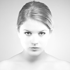
Focus B&W #2
I've also done a high-key version of this, shown here. I think I prefer the darker, higher contrast version, but the high-key has its own appeal. I like the silver hair and the barely detectable outline of the face. The high-key treatment was done in Photoshop so I could preserve some contrast on the eyes, lips, and brows.

Monday, February 19, 2007

Low Key


This is one of my favorite images from my shoot with Rebecca. I was definitely going for an old-Hollywood kind of look and I planned to go B&W. This was done with three grids (two 10's and a 20). I've done shots like this before but I didn't do as much lighting. What make this shot for me are the accent light on her hair and the background. I think the image would be much less interesting without the accent from behind.

Blogging Here Again

I think this will be my photoblog of choice from now on, so I'm catching up with a few images from the last few months. I'd like to post images along with some discussion of how they were created, as well as other photo-related posts. But mostly I'll focus on images.

Soft


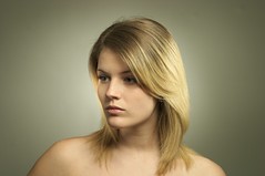
This is a pre-post-production image from a recent shoot with a local model-hopeful. This was done with four lights... a beauty dish provides the key light on the model and three grids round out the lighting... two grids on the model and one on the background.

I'm learning that I really like lighting with grids. Grids give you alot of control and you can really "construct" lighting. I find it easier to achieve three-dimensional images by constructing light with grids than bathing the subject in softboxes. The beauty dish lent a quality to the image that I've not gotten any other way so far.

I have a lighting diagram for this shot on Flickr... click the image to visit the photo on Flickr, there's a link to the diagram in the description.

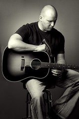
Steve Parsons B&W #2


A second shot from the same shoot. This is probably my favorite, I love the tones and the pose.

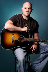
Steve Parsons #3


This was a promo shot for a musician friend. I shot this with two lights, a medium softbox on the subject and a grid on the background. A little saturation and dodge/burn layers made the colors and local contrast really pop.