Tuesday, March 20, 2007

Close


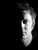
This was an experiment in processing. There's been lots of noise on the net about the image processing that went into the movie "300" and trying to reproduce that look. So I was messing around with some ideas and then went a bit of a different direction. So there's a fair bit of Photoshop going on here.

The crop really emphasizes the title, "Close". It feels claustrophobic and forces you to deal with the intense stare. It also has an incompleteness that adds interest for me (the crop above the chin, for example).

As an aside, Photoshop CS3 really rocks.

Monday, March 12, 2007

Snow Patrol


Not a whole lot to say here except that I wanted this shot and waited for it (and took lots of attempts). People move rapidly at concerts, turns out. I really wanted the streaming blue light with one distinctive pair of hands raised with the lead singer out of focus.

Concert photography may push me over the edge for an 85mm f/1.2. My 70-200 f/2.8 is a fabulous lens but another 2 stops would be huge. This was ISO 800... my 10D (yes, due for replacement) is significantly better at 800 than 1600.

Friday, March 02, 2007

Iain


This was shot with a white foam board background and one beauty dish. 1/250 @ f/16 probably. The beauty dish is just above his face and the camera is right under the dish, maybe 2 ft. away. I like the tones in his hair and his expression.

I'm going back and forth on the highlight in the upper left. At this small size, it bugs me a little, but full screen (in a better color profile) I really like it. I have a second version where I Photoshopped that out with a gradient. For the moment, I'll go with this because it's how I shot it.

EDIT: OK, I like it this way. On the dark background it works for me. On Flickr's white page it was bugging me.

Wednesday, February 28, 2007

Relax


Probably the last one from this series that I'll post... this one is growing on me. It definitely works better in black and white. I love the contrast along the underside of her right arm, and I love where her left hand is. I keep looking at this one... there's something mysterious and unidentifiable that draws me in.

Same four light setup as on the others (beauty dish + 3 grids).

Friday, February 23, 2007

Focus


This is a square crop of "Focus" converted to high contrast black and white. I really like the color versions of these but this one in particular I think lends itself to B&W and a square crop. The B&W forces you to deal with shape and tone and contrast and the square crop further enforces the symmetry.

Again, four lights... beauty dish + three grids. I did the B&W in Aperture after touchup in Photoshop (I prefer to do as much as possible in Aperture because it changes no pixels).

Focus B&W #2
I've also done a high-key version of this, shown here. I think I prefer the darker, higher contrast version, but the high-key has its own appeal. I like the silver hair and the barely detectable outline of the face. The high-key treatment was done in Photoshop so I could preserve some contrast on the eyes, lips, and brows.

Monday, February 19, 2007

Low Key


This is one of my favorite images from my shoot with Rebecca. I was definitely going for an old-Hollywood kind of look and I planned to go B&W. This was done with three grids (two 10's and a 20). I've done shots like this before but I didn't do as much lighting. What make this shot for me are the accent light on her hair and the background. I think the image would be much less interesting without the accent from behind.

Blogging Here Again

I think this will be my photoblog of choice from now on, so I'm catching up with a few images from the last few months. I'd like to post images along with some discussion of how they were created, as well as other photo-related posts. But mostly I'll focus on images.

Soft


This is a pre-post-production image from a recent shoot with a local model-hopeful. This was done with four lights... a beauty dish provides the key light on the model and three grids round out the lighting... two grids on the model and one on the background.

I'm learning that I really like lighting with grids. Grids give you alot of control and you can really "construct" lighting. I find it easier to achieve three-dimensional images by constructing light with grids than bathing the subject in softboxes. The beauty dish lent a quality to the image that I've not gotten any other way so far.

I have a lighting diagram for this shot on Flickr... click the image to visit the photo on Flickr, there's a link to the diagram in the description.

Steve Parsons B&W #2


A second shot from the same shoot. This is probably my favorite, I love the tones and the pose.

Steve Parsons #3


This was a promo shot for a musician friend. I shot this with two lights, a medium softbox on the subject and a grid on the background. A little saturation and dodge/burn layers made the colors and local contrast really pop.